


.svg)


Colors are an excellent way to convey emotion and create a unique personality for your brand. Using the right combination of colors takes a little planning. For example, if your library logo is navy blue and red, the same colors can be used on the website where appropriate, but there are some scenarios you would want to avoid to ensure the experience isn't obnoxious for the viewers or, worse yet, not legible at all. Using buttons that have blue text on a red background is a bad idea.


Things get even more complicated for visitors with color blindness, low vision (common as our population ages), or even folks looking at your website on their phones in the bright sunshine.
When text isn’t easy to read, the chances of people staying on your website to engage with your content, find your events, or discover and access your collection and other resources are diminished.
In this series on digital accessibility, we’ve talked about design guidelines, assistive technologies, doing your own website accessibility audit, and tips for website accessibility compliance. Now we want to give you a handy guide to the best website colors for accessibility and compliance that deliver a great digital experience for all.
 Even people without a visual disability will appreciate a color palette that won’t cause unnecessary eye strain. Check out WCAG’s quick video on color contrast and why it matters.
What is Color Contrast? Simple, but Often Overlooked
Ease and simplicity are expected when people visit your website. And when it comes to digital accessibility, the concept of color contrast is critical. Yet it is one of the most overlooked accessibility issues. It’s also one of the most straightforward strategies to put in place to make sure your website is compliant, and your color choices follow the Web Content Accessibility Guidelines (WCAG).
What exactly is color contrast? If you’re not an artist or designer, you may not know the ins and outs.
Color contrast refers to the difference in light between your text font—or anything in the foreground—and its background. It’s best to have enough of a visual distinction between the color of the text on the page and its background color. When you use sufficiently contrasting colors, your website’s font visibility is stark enough to distinguish easily. This way, the great content you’ve taken the time to develop can be read by everyone.
The question is, which colors work best for high visibility?
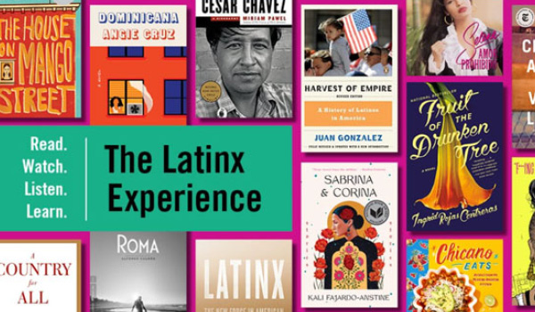
A very well-known example is Apple’s simple black text on white with calls to action in a serious but standout electric blue shade for potential buyers. And note the Pima County Public Library’s use of color with clear white text on blue backgrounds for its top navigation and black and grey text on white for featured material below. Clear and direct is the way to go.
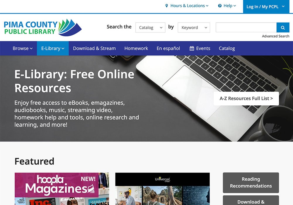
Pima County Public Library uses contrast compliant white text on different colored backgrounds.
Choose Website Colors with High Contrast Ratios
When we talk about good color choices, we’re looking for the best color contrast ratios. These ratios are numerical values that are assigned to the difference in light between the foreground and background. WCAG has a criterion for success for you to follow for color contrast.
The concept of how contrast ratio is used is simple—the higher the contrast ratio, the easier it is to distinguish. Interestingly, the contrast ratio needed to see the distinction clearly varies from person to person. Someone who can distinguish between objects that have a low contrast ratio is very contrast sensitive, while someone who requires high contrast to distinguish between objects has a low sensitivity.
The guidelines say that normal text and images of text must meet a contrast ratio of at least 4.5:1.
There are some exceptions to this rule, including:
Large text, defined as 14 point and bold or larger, or 18 point or larger, must have a contrast ratio of at least 3:1.
Incidental text, or images of text, that are pure decoration and serve no user purpose do not have to meet color contrast requirements.
Brand logos do not have to meet color contrast requirements.
Thankfully, you don’t need to be a web design expert to see how your website measures up. You can run your color choices through one of the many free color contrast accessibility evaluation tools, like the WebAIM Contrast Checker Tool from WebAIM, a non-profit organization based out of the Center for Persons With Disabilities at Utah State University.
If you don’t know the color code to plug in, WebAIM suggests using Colorzilla to extract the color value from any page element. Also, WAVE can analyze contrast ratios for all page text elements at once. WebAIM offers a link contrast checker to evaluate links that are identified with color alone.

There’s even a Chrome extension you can use to simulate color blindness to get a sense of what people with color blindness would experience on your website, and make improvements.
We know that color is a powerful tool to capture attention and engage your website visitors, so you want to make well-thought-out choices for compliant color combinations.
Here’s the thing: unless you’ve paid specific attention to color contrast, there’s a good chance your elements will get flagged for color contrast issues. For example, many common user experience design practices, like using light grey to indicate inactive fields, do not pass the color contrast standards guidelines.
And, as the Bureau of Internet Accessibility points out, “It’s important to keep in mind that these designated numbers, just like all WCAG checkpoints, are not arbitrary—they’re specifically designed to help more people access the information on your website.” Improving accessibility is great for everyone.
|
|
Providing An Accessible and Inclusive Digital Library Experience It’s up to software vendors and users to create inclusive digital spaces. Find out how we’re doing that in BiblioCommons products.
|


Make Sure Color Contrast Isn’t an Afterthought
Here are a few tips to put color contrast into practice on your website:
- Your branding and website design go hand-in-hand. Create a contrast-compliant color palette that your team can use for accessible design for your branding colors and all materials. You can incorporate those colors into your website to fully support accessibility and branding. Check out this free tool, the Accessible Color Palette Builder, which helps you create a palette of up to six colors and shows you a matrix of which color combinations meet the WCAG standards.
- Remember that all website features need to be visible to be usable. Don’t forget about navigational elements, menus, footnote regions, or any area on your website that your visitors will see or interact with.
- It’s good practice to review and test colors in the design phase before going live. This helps prevent re-work and allows more time to make any needed tweaks and revisions.
Color contrast has a huge impact on the accessibility of your digital library services, so definitely something to keep top of mind! We’ll dig into more digital accessibility and strategies for overall website performance in our next blog in the series.
Sign up to receive the latest in public library topics delivered straight to your inbox!