


.svg)


Getting started with accessibility standards and compliance can feel overwhelming. You may feel the need to make major changes, even doing a total reboot or rebuild.
Rest assured. Providing a more accessible experience will be a journey, and each small step you take will help. You can likely make some immediate, small, and meaningful changes to make your website more usable and accessible.
Hands-On Changes to Boost Inclusive Design and Function
In this series on digital accessibility, we’ve talked about design guidelines to improve your library’s online services, assistive technologies that your patrons are using, and doing your own website accessibility audit.
Next, here are 6 simple ways to make your website a great digital experience for everyone:
1. Create a Plan to Regularly Review and Advance Your Website’s Accessibility
Practice, try, learn, and keep going. Accessibility advocates and technology experts are constantly learning and improving accessibility supports, and so can you. The most important thing you can do is commit not only to a one-time audit or checklist but to an ongoing practice of accessibility improvement.
Create a regular calendar reminder for yourself. Attend or start a meetup and invite users, local accessibility advocates, team members, or colleagues from other libraries. Challenge each other to learn about a new accessibility term or guideline and how it applies to your website. Each time you review, make another meaningful adjustment, and soon you will significantly improve your website.
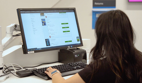
2. Write Helpful and Descriptive Alternative Text for Your Images
We know that websites with images and photos perform better in search rankings and get more views. They also help with storytelling and promote social sharing, which are essential to growing your library community.
But how do they work for people who are blind or have vision impairments?
These visitors to your site likely use screen readers to read the text displayed on the computer screen with a speech synthesizer or braille display. Screen readers rely on the alternative text (“alt text” for short) that describes those visuals. You want to write alt text that describes what’s happening in the image (which might include a chart or graph) and how it relates to the surrounding content. Then you add it to an image using the <alt> attribute within an HTML image tag.
The alt text helps users interpret the image and understand how it relates to the rest of the content and the web page. You may also have images that are purely decorative, so you can add an empty <alt> attribute to the image that tells the screen readers to skip that image.
Tip! Make sure that none of your images are created with text designed into the image because a screen reader cannot read the text in images. This is also problematic when a browser window gets smaller on a tablet or mobile. The image with the text gets smaller, making it difficult for any user to read.
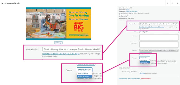 BiblioWeb makes it easy to manage alt text for images. When you upload a new image to the Media Library or edit an existing one, you can select 'Decorative' or 'Informative' from a dropdown menu. If the image is informative, you can add descriptive alt text. The best part about this feature is that your setting will apply to your image everywhere it appears, whether in a card, a page, or a browser banner. This article in the Partner Portal describes the process in detail.
3. Check Your Screen Reader Accessibility
Does your complete website work for a screen reader? We’ve talked about alt text for images, but you also want to tab through your pages with the screen reader active. This way, you can check that all links, buttons, and other controls are clearly identified and accessible.
How would you know, exactly? Carefully listen as the page is read aloud. Are all website links unique and functional? How do your forms work? If they generate errors to flag the reader’s attention, are the errors read out by the screen reader? You also want to check for headings that are identified and in the correct order. Along the same lines, make sure that all the page content is read in the proper order.
Tip! For screen reader testing, you can use JAWS for 40-minute testing for free (and then download again and reset your timer if you need to) or NV Access (non-visual access to technology) which is also free for use.
4. Make Sure Your Users Can Magnify Your Text for Easy Reading
Vision impairment is a common and growing concern, especially when considering North America’s aging demographic, which is experiencing vision loss. To serve this population, you need the text on your website to be as legible as possible. Test it yourself in your browser or on your device with your Zoom tool to resize the text only to 200%.
Is content getting cut off or overlapping with other content? Is anything hidden or triggering additional scrollbars? You don’t want to make it difficult to use buttons, links, or other controls, so double-check the clarity of all text.
Tip! Generally, zooming or enlarging text is managed by the browser or device, not your website. If you find this is a problem for you, the best way to improve this is to make sure you (or your developers) code to take advantage of the default methods. Here, you can learn more about some best practices for developing more accessible text.
|
|
Providing An Accessible and Inclusive Digital Library Experience It’s up to software vendors and users to create inclusive digital spaces. Find out how we’re doing that in BiblioCommons products.
|

5. How Legible Is Your Content? Examine the Contrast Between Content and Its Background
Did you know that 83.9% of homepages surveyed in 2022 had low contrast text?
Color contrast is a critical part of website accessibility. If your onscreen text doesn’t have enough contrast from its background, it can be a serious headache to read. For people with low vision, it can put them off entirely. Think blue text on an orange background or red text on a green background. Not easy at all! White backgrounds are recommended with strong, simple standout colors for text, like black and navy.
The ideal contrast ratio between text and background should be at least 4.5:1. For content that’s at least 18pt or 14pt bold, the minimum contrast ratio drops to 3:1, giving you more color options for design.
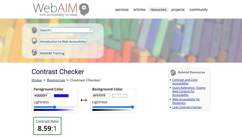
If numbers and ratios sound a little overwhelming, there are free web tools to handle the math, including the WebAim Color Contrast Checker. Enter the color hex code for your text and your background, and it’ll tell you if the color combination passes.
If you don’t know the hex codes but have the RBG or other values, use a tool like the W3C Color Converter to get the hex values.
If you find illegible text, adjust either the foreground or background color until you get to an accessible output. Make sure you check both smaller and larger text sizes because some colors can be easily discerned in large font sizes but are illegible with small or bold fonts.
Tip! Once you find some accessible combinations, create and keep a cheat sheet with the best combinations for your library, its colors, and its brand.
6. Review Your Focus Order to Double-Check Navigation Ease.
Is your website easy to follow? Here’s a checklist to make sure:
- Can a library patron easily tab to key functions like main content, log in and search?
- Can you tell where you are on the page?
- Does the tabbing order flow from bigger tasks like navigation to smaller tasks like reading detailed text?
- Can you use your keyboard to access everything on the site/page?
- Can you tab to use key functions like placing a hold on a book?
Tip! Create an outline (like a table of contents) for your page or website. Make sure your tabbing order logically flows from one section to the next, never skipping a section without a user explicitly choosing to do so.
Every library wants to be an inclusive hub online, connecting people with resources, information, discovery, and a true sense of belonging to the community—making your website more accessible can do just that.
These changes will help kick start your accessibility journey and help you create a better, more equitable, inclusive, and enjoyable experience for all.
Learn more about digital accessibility as we look in-depth at contrast compliance for your website in our next blog and other strategies for inclusivity to follow.
Sign up to receive the latest in public library topics delivered straight to your inbox!