
.svg)


According to user experience professionals, inclusivity is at the heart of making digital platforms useful, usable, and enjoyable for users of any identity, background, or experience.
To achieve that goal, they recommend strategies like involving users in the process and talking to them about their needs. They also suggest building a team of people from diverse cultural backgrounds with varying abilities to develop and manage your website.
“If we don’t intentionally include, the risk is to unintentionally exclude.” – Vale Querini
Any visitor to your library website can experience exclusion if they’re denied access, perceive their private information has been exposed, or get frustrated by not being able to find what they’re looking for.
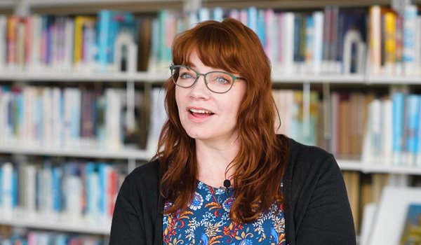
Like your physical space, you want your library website to make all visitors feel welcomed, safe, and valued. A big part of the first impression online includes the images and text that set the tone. The nuances of the language and images go well beyond meeting Web Content Accessibility Guidelines (WCAG).

First Impressions Matter Most
This Library 2.0 Accessibility Blog series has talked extensively about why digital accessibility matters and tools to achieve compliance and evaluate your website’s success. So, here’s a handy primer on best practices when it comes to graphics and text.
Inclusive design is about thoughtfulness. You want to make certain no one is excluded because of their abilities, but you also want to extend the same intention to people who are often excluded for other reasons, like age, race, background, and gender identity.
Visual elements capture attention making your website memorable and engaging. Not surprisingly, large, high-quality images are most appealing, according to eye-tracking research on web usability.
Is there a diverse range of people depicted in photos, icons, and illustrations? Are different skin tones, physical characteristics, and abilities represented? How about families with different compositions, including same-sex, non-binary, or multi-generational families?
Think Outside Your Own Viewpoint
When you put diversity on your agenda, the aim is to show the full spectrum of humanity. Some great sources of inclusive branding inspiration are Airbnb’s visual identity and Microsoft’s inclusive design methodology that relies on minimalist line graphics to portray many audiences—their inclusive design toolkits are also great!
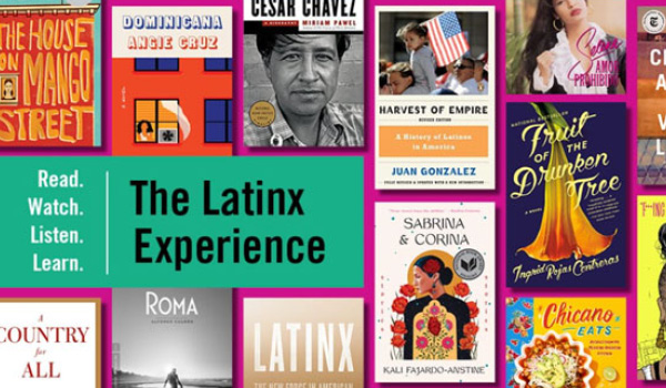
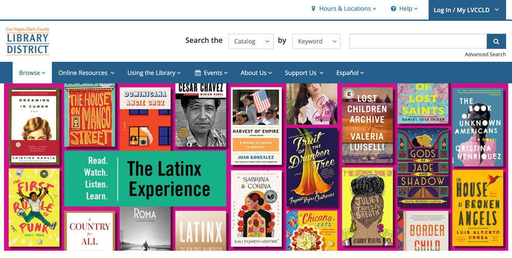 A great way to be inclusive without investing heavily in custom graphics is by creating website content for multiple audiences. Las Vegas-Clark County Library District does a great job of this with their many audience pages, some of which are Latinx, Native American, and Veterans.
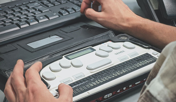
What about visitors with low vision who rely on screen readers to read aloud onscreen text and elements, such as buttons? This common assistive device also reads the visible text and nonvisible descriptive text, like the alternative text, or “alt text,” that tells users what the image is all about. And when an image fails to load, alt text will appear so that all visitors can understand what they’re looking at.
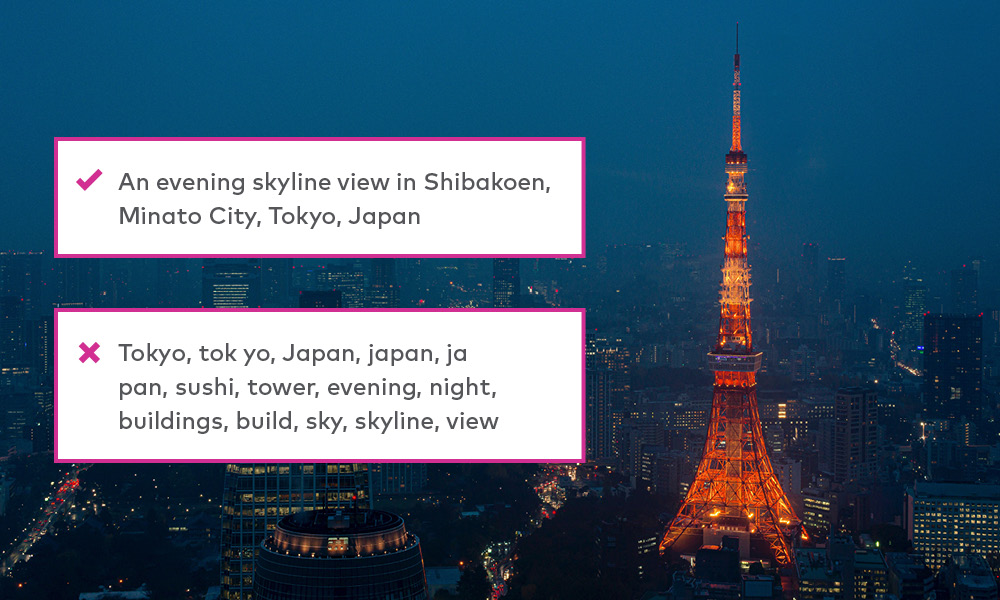 A good tip is to include targeted keywords to boost search engine optimization and inform visitors about on-screen images. You want short, concise alt text that can be read quickly by a screen-reader and give the reader context. An example here shows a photo of the Tokyo Tower and skyline with the alt text, “A rooftop view of the Tokyo Tower and skyline at night.” Photo by Marek Okon on Unsplash.
And keep in mind that captions below images and body text next to images may actually slow screen readers down, so if the essential information is contained in captions and body text, you can leave the alt text tag empty.
You want to make all your text simple, clear, and meaningful to help visitors follow the narratives, navigate headings, and use buttons and links to find what they’re after. Ultimately, the shorter the text, the faster someone using a screen reader can navigate.
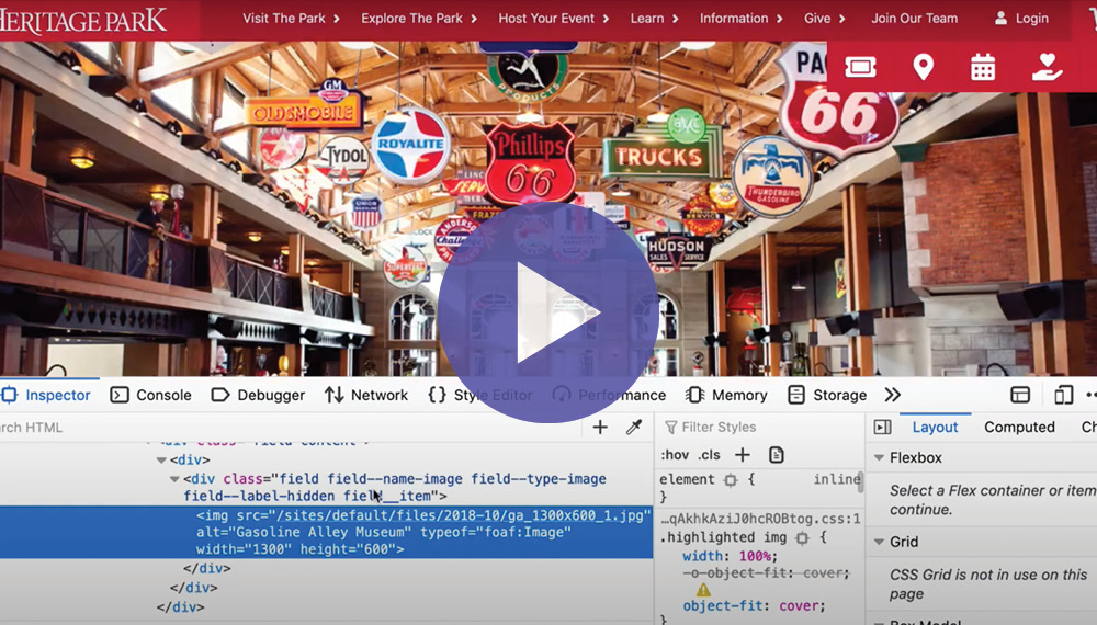
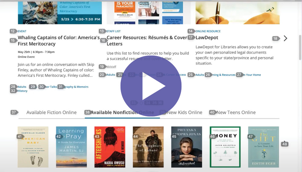
This short video provides great tips on improving image accessibility with alt text.
Accessibility Goes Beyond Screen Readers
Your website experience relies on inclusive images and text, and that means accessibility fundamentals for everyone. You need to consider the unique needs of people with cognitive, motor, auditory, and neurological disabilities, outlined in this ALA Annual presentation by BiblioCommons.
Learn concepts to serve your patrons with accessibility needs outside of screen readers and discover web accessibility fundamentals for cognitive, motor, auditory, low vision, and neurological disabilities.
Is there a one-size-fits-all solution? Not really, but an important point to keep in mind is that making your images and text inclusive and easy to follow improves the digital experience for everybody.
|
|
Providing An Accessible and Inclusive Digital Library Experience It’s up to software vendors and users to create inclusive digital spaces. Find out how we’re doing that in BiblioCommons products.
|

Constraints Push Us to Innovate with Better Design
Interesting to note, accessible design isn’t often thought of as innovative or beautiful, says UX Collective design magazine. But consider that, “some of our biggest technological breakthroughs emerge from the disability sector (email, typewriter, touch screens, voice user interfaces). In the creative process, constraints are what we need to push our thinking further outside the square, enabling us to design better.”
Making inclusive design a guiding principle will result in a more innovative website. Even better, you’re going to have a direct and positive impact on all your digital library visitors.
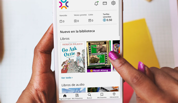
Looking ahead to the final blog in our accessibility series, we’re going to focus on the mobile experience for patrons. According to the Pew Research Center, 97% percent of Americans own a cellphone. It’s common to hear that many users who don’t have a computer or internet connection at home, have a cell phone they rely on. How accessible is your library’s mobile app? We’ll cover mobile app accessibility in our next blog. See you then!
Sign up to receive the latest in public library topics delivered straight to your inbox!