

.svg)


How do you get people excited about digital books, audio books, and magazines, along with all the other resources available at your library?
With simple and easy access, whenever they want, from wherever they happen to be. People can borrow items from your collection instantly for free with a library card and a smartphone when you have a great app to offer. Apps are definitely at the forefront of how people want to get info, do business, travel, shop, and help them sleep.
Just consider the stats: Americans spend 88% of mobile time on apps. The average smartphone owner uses 10 apps per day and 30 apps each month, and as many as 21% of millennials open an app 50+ times per day.
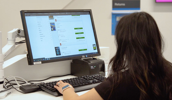
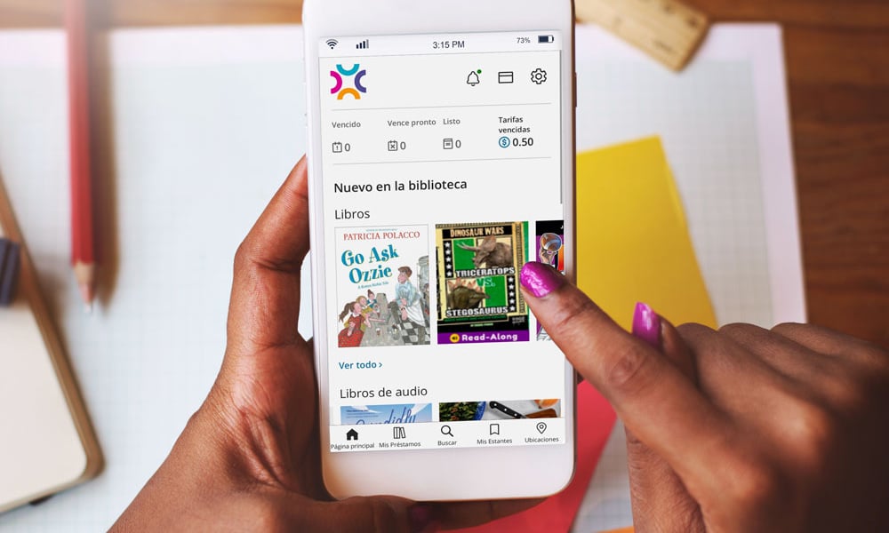 A Pew Research Center survey found that half of the people who visited public library websites used handheld mobile devices. The survey also found that for Americans using libraries’ digital tools, searching library catalogs for content is the most prevalent activity. You want your app to showcase the best of your mobile catalog front and center on the landing page—think modern design principles with more content and more white space to really wow your visitors. (Image by rawpixel.com)
So, how does your app work for people searching your catalog for content?
And, most importantly, does it work for everyone – including people with low vision, cognitive challenges, or situational disabilities like a wrist injury from a fall or eye strain from working long hours on a computer, all of which can affect how people interact with their devices at various times.
We’ve dedicated this blog series to digital accessibility and why it matters and providing a toolbox to help you deliver the most inclusive experience to all your visitors.
Now we want to guide you through some best practices to make your library app a sought-after download to access valuable library resources and be part of the library community.
An Inclusive App Strategy Is Good for Everybody
On the tech side, mobile platforms like iOS, Android, and Windows have recognized the importance of accessibility and supporting accessibility features as part of their operating systems. ADA compliance (to meet the Americans with Disabilities Act Standards for Accessible Design) can be complex, so this kind of support is critical.
Investments in accessibility features have resulted in customizable features and benefits for all, including adjustable text size, voice assistants like Siri and Alexa and haptic feedback including vibrations letting you know when an action is completed (which are now part of Google’s Material Design guidelines.)
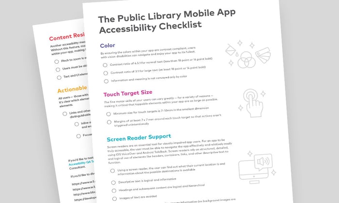
Is your library considering a native mobile app? Are you wondering if the mobile app you have is serving your patrons as best as possible, particularly those with special needs? Download The Public Library Mobile App Accessibility Checklist to find out.
Key Steps to Support Personalization: Text, Assistive Devices, and Color
You want your app to work for everybody, giving people the option to create their own custom experience. Let’s start with text.
Apple developer guidelines state: “When designing an inclusive app, keep text size, weight, and layout in mind for clarity and readability.”
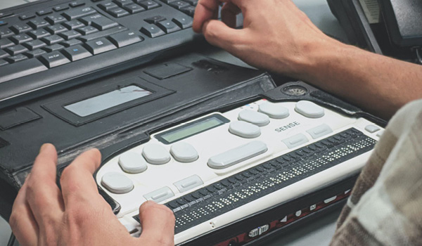
BiblioApps, for instance, has a built-in dynamic type feature where users can choose the size of the text on the screen for larger sizes or braille for readability.
Also, keep in mind that your mobile app can be viewed in different resolutions where users have the option to zoom in up to 200%. You want to test your app’s layouts and symbols to make sure they scale properly. These elements need to adapt to all font sizes, the bold text accessibility feature, and different resolutions for a good user experience.
When a Visitor Relies on Screen Readers
When you can’t see the mobile screen, can voice navigation take you where you want to go?
VoiceOver, the common screen reader, essentially walks people through your app, interacting with objects so that users can navigate the interface even when they can’t see it. When you consider the aging population and mass vision loss that’s forecast in the decades to come, screen readers are going to be in demand, along with the best in accessibility software.
Descriptive text that describes images, links, and prompts navigation is imperative. It tells people where they are on the screen and how to interact with elements to find what they’re looking for or put popular titles on hold, for example.
When you’re looking at your navigation, think about the clarity and number of steps visitors need to take to find info. You don’t want them to struggle with a multitude of confusing screen swipes to go deeper.
One technique is to divide the page screen into three tabs—much simpler to view—with underlined areas on the screen that indicate an additional swipe.
When Shopify looked at current mobile design trends, the company found that more apps are putting important navigation elements at the bottom of the screen. Now an industry standard, the bottom navigation bar goes a long way to helping all visitors use core features of the app in what’s basically a single tap.
|
|
Providing An Accessible and Inclusive Digital Library Experience It’s up to software vendors and users to create inclusive digital spaces. Find out how we’re doing that in BiblioCommons products.
|

Make Color Contrast Work for Everybody
It’s not great when you’re trying to read light-colored text on top of a white background. Or dark text on a black background. Both scenarios can be difficult to read for most of us and likely near impossible for someone with a vision impairment.
The same goes for navigation buttons, links, and forms. The color contrast between the elements in your app makes content easier to quickly understand and follow. There are very clear guidelines on color contrast—and we’ve talked about it extensively in this series:
- Text, and images of text, should have a contrast ratio of at least 4.5:1, except if the text is pure decoration.
- And larger scale text, at least 18 point or 14 point bold, or images of text can have a contrast ratio of 3:1.
We’ve covered some essentials here, but accessibility in technology continues to evolve. You must ensure that your library stays current with the trends and expectations (and have BiblioCommons on your side!)
The point to circle back to is that designing a mobile app with accessibility top of mind provides a great digital experience for everyone.
How the Right Technology Taps into Human Potential
Creating a digital accessibility strategy for your library will get people in your organization to take notice and change priorities. It’s a mindset shift that will help grow your patrons and open new doors—virtual ones—to diverse groups and people with unique strengths and challenges.
As Debra Ruh, global disability inclusion strategist, puts it:
“Accessibility allows us to tap into everyone’s potential.”
This wraps the end of our digital accessibility blog series. We hope the articles helped you and your library further understand accessibility principles and how to apply them to create a more welcoming experience for all patrons. If you have questions about the accessibility compliance behind any of the BiblioCommons products, don’t hesitate to contact us.
Sign up to receive the latest in public library topics delivered straight to your inbox!