
.svg)


Here’s a question for you: Have you ever been frustrated by an assemble-it-yourself furniture project? The instructions are supposed to be easy to follow, but you find yourself begging a friend to help or hiring someone to do it for you—or worse yet, abandoning the project altogether and returning the item.
Well, the same can happen when websites aren’t well-designed.
Start searching the web for information, and you’ll land on sites that flash images with lots of colors and sounds. These moving images are meant to grab your attention and keep you scrolling, but they can also have adverse effects.
For some, flashing images and constant motions can cause physical reactions like vomiting and dizziness. They can even cause seizures (a mental surge of energy that the brain can’t keep pace with). People who are autistic and have sensitivities to noise and motion, for example, or those who have epilepsy, may need to avoid high-motion, brightly lit websites.
Shouldn’t everyone be able to access information online and have a positive digital experience?
The answer is yes, which is why accessibility legislation and advocacy groups work to make it happen. Broadening diversity and inclusion in organizations across all sectors is now on the agenda.
It’s also why BiblioCommons has dedicated a blog series to help libraries provide patrons and visitors with an inclusive digital experience everyone will love. We’ve looked at why digital accessibility matters, design guidelines to improve your library’s online services, and assistive technologies that your patrons are using.
Next, we’re going to focus on your website accessibility audit.
How is it performing for people with unique challenges? Are they able to find your staff picks for favorite new books or register for that weekly webinar on cooking on a budget?
The inclusivity of your website’s design and function can be tested and improved so that your library can level the digital playing field for all users.
 Libraries that subscribe to BiblioCommons have access to the Partner Portal, which includes guidelines and best practice articles. Some of the content in the accessibility articles includes how to treat heading hierarchy, when to add alt text to imagery, and what labels to use for links.
Practical Tips to Improve Your Website for Everyone
Let’s get to it! What can you and your team do to make your website better for everyone?
Here are 5 top tips to inspire and get you going.
1 - Start with an accessibility audit:
This will give you a detailed look at how to improve your website and meet web content accessibility guidelines (WCAG) defined by the international standard body World Wide Web Consortium (W3C) and its guide to the development of digital products.
You can take advantage of some free online tools and plugins to detect any accessibility problems. These include the WAVE Web Accessibility Evaluation Tool (a browser plugin), Google Lighthouse (that gives you an accessibility score), and Stark software.
User Experience (UX) consultants, the go-to experts in user-friendly digital design, are quick to point out that compliance with the web content guidelines isn’t guaranteed with these types of automated checking tools and won’t give you the complete picture.
“In my experience, one tool rarely does everything,” says Olena Bulygina of Inviqa. “This means you may have to use specific tools to check specific aspects like contrast.”
For the uninitiated, the right contrast makes sure the use of color doesn’t interfere with or compromise any of the text legibility. People with impaired vision, for instance, need screen text to be clear and simple. And who doesn’t appreciate easy-to-read typefaces?
Tools are a start, but manual checking is definitely recommended.
2 - Check your site templates against the WCAG guidelines:
Look at your website templates, where design elements are repeated in the same way across the website. This way, you can audit one instance of the template against the guidelines rather than each separate instance, which is a great time-saver.
Yes, this means rolling up your sleeves for the manual process, but the guidelines lay out precisely what you need to check. Here’s a great checklist and resource from the A11Y Project (#A11y is an abbreviated version of “accessibility” for social networks). And TetraLogical has a handy primer on WCAG principles and how to apply them.
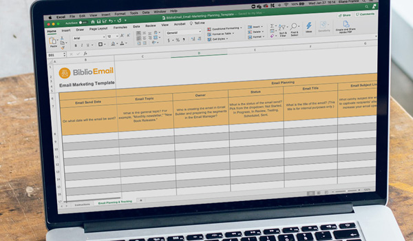
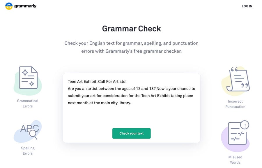 To make your language accessible to multiple audiences, run your copy through an editing tool like Grammarly or Hemingway Editor. These tools not only review spelling, but also provide grammar, punctuation, and clarity suggestions. Image by Grammarly.
3 - Improve readability:
This is a big one and multi-faceted. Start by considering the language you use site wide. The simplicity of the words themselves is important to people with reading challenges, the typography and color contrast impacts people with vision troubles, and consistency across the site affects those who are cognitively disabled.
Basic readability rules of thumb? Keep text left or right-aligned, line spacing and paragraph spacing should be at least 1.5x and paragraphs should have no more than 80 characters.
You also need to think about reducing cognitive load, which makes your site easy to navigate for all users, whether they’ve had their first coffee in the morning or not. Make sure to define any abbreviations at first use, look at your link text to see if it is easily directs your reader to what they’ll find when they use that link, and match identical URLs with identical link text (again for consistency and ease of use throughout your site).
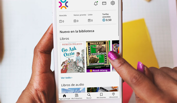
Plus, a clean, well-organized site structure makes a difference to all users. This takes careful planning. You want to structure your content with appropriate and clearly-worded headings. On that note, software like BiblioWeb has an automatic headings module for website-building accessibility best practices.
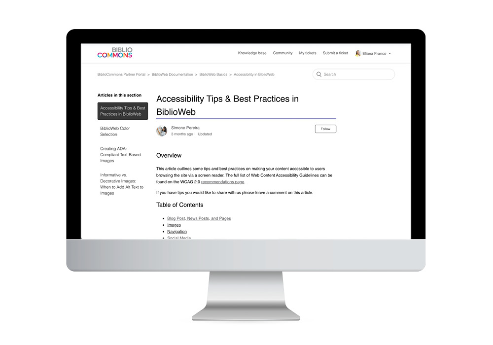
You can tell which headings are used on a page by using a browser plugin. For example, Web Developer for Chrome has the option to view the document outline and see a view of all the headings used on a page. Libraries that are subscribed to BiblioCommons can see instructions on how to do this (and more) in the Accessibility Tips & Best Practices in BiblioWeb article in the Partner Portal.
Simple language can be undermined by color use. Ever looked at a store or restaurant sign that was hard to read because the words didn’t stand out from the background? You’d likely walk on by. Make sure that color choices on your website don’t compromise text legibility.
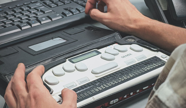
When talking about readability, we also have to enhance website content for screen readers that audibly read what’s on the screen for people with vision impairments. Images and icons, for example, need to have appropriate alternative text labels. Design elements with no accompanying text can also be described behind the scenes using HTML.
Also, consider magnification. You want the main workflows to work equally well for people with screen magnifiers.
4 - Boost your keyboard access:
Not everyone uses a mouse, so you want your keyboard and other non-mouse input devices to be able to operate your website. If an element requires hovering or precise clicking, that can be a massive roadblock for some users. The bottom line here is that every element must be accessible from a keyboard, including links, buttons, controls, and fields. The tab and arrow keys play a vital role in this functionality.
|
|
Providing An Accessible and Inclusive Digital Library Experience It’s up to software vendors and users to create inclusive digital spaces. Find out how we’re doing that in BiblioCommons products.
|

5 - Don’t create pressure:
Life can be challenging enough without creating added pressure for people who come to your website. Those carousels, popups, alerts, and distracting animations or flash-motion images may grab eyeballs, but they can be overwhelming and even anxiety-inducing for people with motor or cognitive disabilities.
Interfaces have become a lot more dynamic, but a more so-called imaginative user experience can be a detriment for many. The best approach is to simplify your website layout and remove unnecessary dynamic elements. Anything that scrolls, blinks, or moves automatically, without user interaction, should also be controllable if it lasts for more than five seconds. Give the user more control (and confidence) by letting them easily dismiss any alerts or visible obstructions with the esc key.
There’s a lot to think about when it comes to accessible websites. When you’re building a culture of inclusiveness in your library, helping people understand unique challenges—and the strategies to solve them—is like the gateway to making change.
Next in the series, we’ll look at quick and easy hands-on changes that you can make to your website today to make it more compliant and inviting. Come on back for more!
Sign up to receive the latest in public library topics delivered straight to your inbox!