

.svg)


Library websites need to work hard because libraries do so much for their communities. You want to engage your visitors, grow the number of card-carrying patrons, increase the lending of your collection, and expand participation in all your community services.
Your website sets the stage for an inviting and inclusive experience for all. And that’s a good thing, because more accessible design improves the experience for everyone regardless of their abilities.
Here are a few key steps to evaluate your library website to serve your patrons and community better:
- Clear and consistent navigation
- Keep patron information private and secure
- Go for inclusive, accessible visual appeal that makes a lasting impact
- Get the most out of your content creation by repurposing
- Be strategic about your readers’ advisory content
1. Clear and Consistent Navigation
Can people easily find what they’re looking for? Users need to feel confident that they know where they are in your website and how to get to their next step. Remember, your audience may have different needs than you (no library context, low vision, cognitive issues, language barriers), so put yourself in their shoes when navigating your website.
Here is a checklist of best practices to help you improve your navigation:
The navigation and a link to your home page appears in the same place on every page – logos can be helpful for branding the home page link, just remember your alt text!Users can navigate backward and forward using the browser controls (back and forward buttons)
Users have clear indications of where they are in the site and how to move from there to similar (“breadcrumbs”)
Users can find the section or content they want in fewer than 5 actions (clicks, searches etc...)
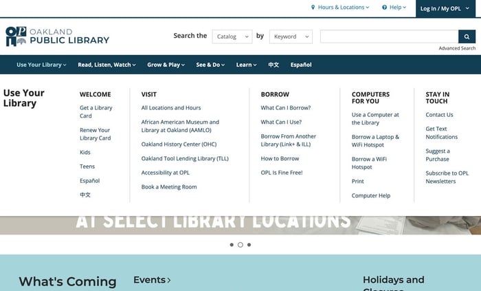
Oakland Public Library is very intentional about the way their navigation menus are laid out. They take into consideration the users point of view and are organized by, “Use Your Library,” "Read, Listen, Watch,” “Grow & Play,” “See & Do,” “Learn,” and languages.
2. Keep Patron Information Private and Secure
Do your patrons feel confident that any information they provide the library is safe? Libraries are an important public resource to their communities and patrons should feel confident that the information they enter on the library website will be handled with care. This includes the website itself following security protocols, as well as the forms, payments, and patron data handling.
Checklist:
Your library website has an updated Secure Sockets Layer protocol (SSL) certificate that authenticates a website’s identity and creates an encrypted connection for your patrons
Forms: Patrons submit over a secure connection and private information collected is limited
Payments: Payments are submitted through a trusted payment provider over a secure connection
Patron data: Limit the amount of data you collect and keep, encrypt it at rest and in transit, purge it from time to time and always on request
|
|
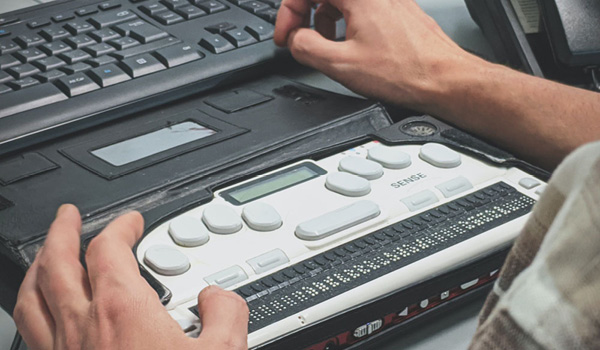
Providing An Accessible and Inclusive Digital Library Experience It’s up to software vendors and users to create inclusive digital spaces. Find out how we’re doing that in BiblioCommons products.
|

3. Go for Inclusive, Accessible Visual Appeal That Makes A Lasting Impact
For sighted users, clear visual structure and a clean and cohesive visual approach can help amplify the library’s brand and story, draw a patron, and guide them to the content and resources they care about. For low- or non-sighted users, that same clear structure, coupled with cohesive and useful alt-text should do the same!
Checklist:
Start with an outline or structure (just like an essay) and identify what types of information you want to convey and where they should go on the page.
Drawing it out can help!
Think about mobile first, then desktop. Create a standard for your visuals including:
Great alt-text
Alignment to your library brand (colours)
Diverse representation
Use clear, accessible and easy-to-read fonts that work with your library's brand
Update your content periodically to give repeat visitors new information but keep the outline or structure the same
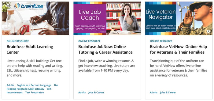
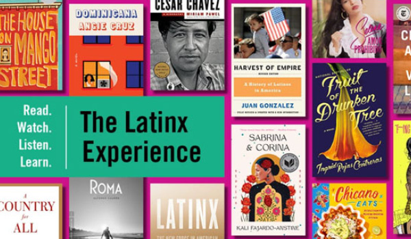
Santa Clara County Library District visually depicts its different resources with imagery that is contextual and categorized. Instead of using the Brainfuse logo across all of their resources, they have images that represent the unique resource and bring in the Brainfuse colours for grouping.
4. Get the Most Out of Your Content Creation by Repurposing
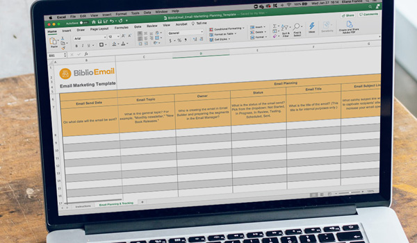
Your staff works hard to create fantastic content, from readers’ advisory lists to events resource lists. Maximize your return on investment by using your content on multiple pages. This entails using hyperlinks within your copy to promote and link to other places on your website.
Do you have software that allows you to create content on your website and use it in multiple places at the click of a button? This way, you can share a storytime event on the homepage and the kids page, and re-post evergreen content where it works best. By reusing content on multiple pages, you can make sure the most important messaging you want to convey is front and center on all the appropriate pages at the most suitable times.
Checklist:
Identify all the different types of content you have (bib records, events, resources, lists, etc.)Identify your different audiences and the content they might like
Create pages or blogs for different audiences or events
Mix and match the content on the page, providing links to related content
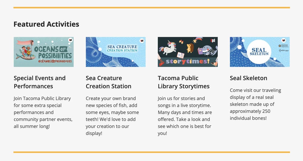
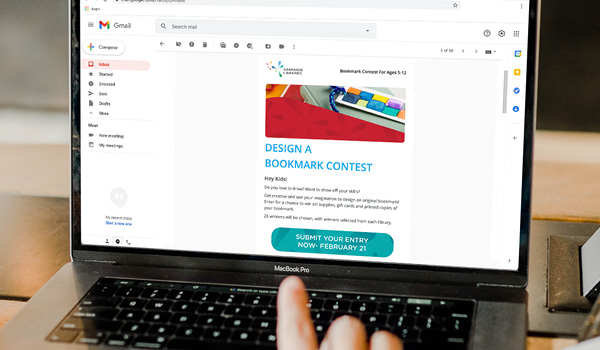
Easily repurpose events on multiple website pages to extend their exposure with minimal effort from library staff. For example, Tacoma Public Library’s Featured Activities appear on the Summer Reading page, as well as the Kids & Families page, the Tweens & Teens page, and of course, the homepage.
5. Be Strategic About Your Readers’ Advisory Content
This is a big one and often what keeps your patrons coming back to your library. People turn to libraries as a trusted source of entertainment and education. They want to know what excites your library staff members—and what’s coming up next in terms of new releases in your collections and new programs.
Checklist:
Feature your library carousels and staff lists prominently on your homepage, audience pages and/or program pagesKeep them updated! Readers are quickly turned off by content that’s out of date, inaccurate or irrelevant
Link directly back to your catalog for easy and convenient access
If you’re linking out to external sources for content, like the New York Times Best Sellers list, double-check to see if that source is up to date
Use tags and links to help patrons find more and related content
Use and reuse your readers’' advisory content for different audiences and in different products
These are all important steps to help you evaluate the impact and success of your website. Check out our blog on how to do an accessibility audit if you haven’t done so already.
Next up, we’ll take a deep dive into exactly what we here at BiblioCommons are doing about accessibility. We want to make web products and design more accessible for visitors—and the creators of those invaluable digital library experiences. Come on back!
Sign up to receive the latest in public library topics delivered straight to your inbox!