
.svg)


What makes a great website? Well, that’s a big question, but a very important part of any website are the visuals and images used. In this article we’re going to discuss the importance of visual elements to your website, three main styles of imagery, and ways to find great free images you can use.
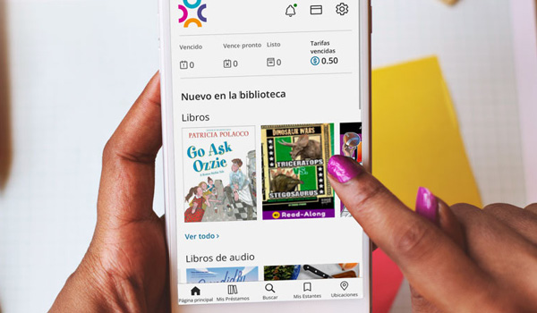
Although the content, information, and functionality of a library website will always bring patrons in to find information like hours, branch locations, and new titles, the imagery of a library website is what can entice and encourage patrons to stop, visit, browse and come back for more.
Visuals are incredibly important when we communicate. Almost 50% of our brains are engaged in visual processing, and the human brain can get the overall feel for a visual scene in less than 1/10th of a second! Many websites are chock full of text and great information, but too much text can lead to information overload for visitors. On a daily basis the average person now sees 5 times more information as they would have seen in 1986. That’s equal to almost 174 newspapers worth of data every day. That’s a whole lot more information coming your way! The average website visitor only reads 28% of words on a page per visit, and higher-literacy users tend to scan a lot of the text they see.
So, what does this all mean for your library website?
Images are key!
At BiblioCommons we’ve divided up the visual designs of library website’s into three main categories, as these three design types reflect the three main BiblioWeb website design templates we’ve created for libraries to utilize when creating their website. This doesn’t mean there aren’t other options and designs out there, and libraries using BiblioWeb are encouraged to develop their own designs and have the flexibility to do so, but these three templates will frame this discussion of image management.

Ask yourself:
How might the images on our website be best used to reflect the brand of the library?
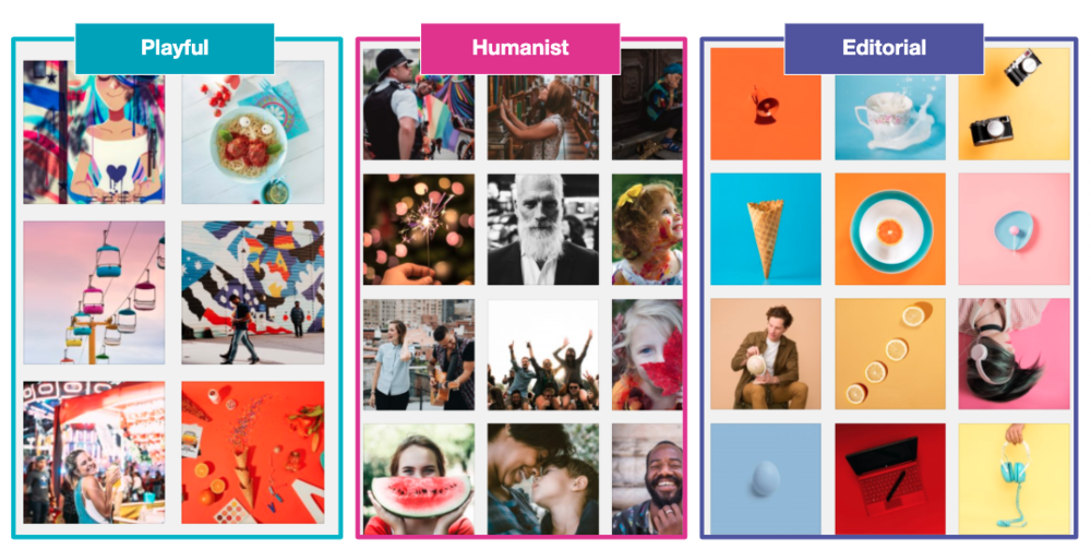
Playful

A Playful website, playful brand, or playful design is one that’s fun, friendly and conversational. It will utilize bright colors, and is a way of creating visual designs that can spark the imagination.
Playful designs will be very image heavy, and you’ll need to have a good idea of what you want the overall visual design of your website to look like. A playful theme can use photography with bright colors and backgrounds, illustrations, iconography, cartoons or simply bright library branding to create a cohesive and complete look, even while using lots of color.

Humanist
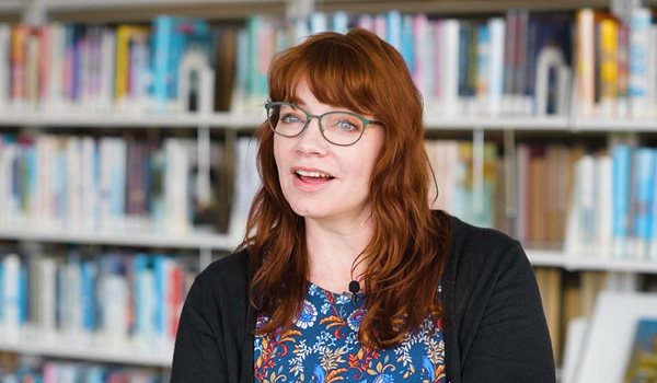
A Humanist website or brand is one where your content takes center stage. It’s an overall look that balances modernity with elegance, and is a great idea for libraries that want to focus on content curation and content creation. Humanist photography was specific to a type of photography in the mid-twentieth century, and it referred to the middle ground between realism and modernism. What does that mean for your website? A more humanist feel to your image selection would be choosing images with people in them, and really focusing on the emotion that the photo reflects. Keep in mind that this overall look should be simple, inclusive, friendly and clear when you create your content.

Editorial
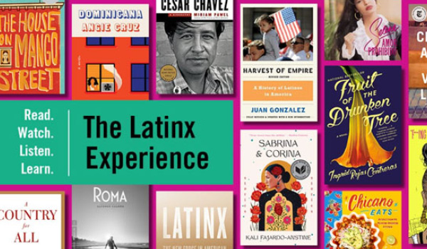
An Editorial look will be literary and contemporary. It can still embrace color and whimsy, but with an overall artistic direction so anyone can see that all the imagery goes together in one theme. Libraries that want to convey a strong personality and brand through their websites can use an Editorial look, and this type of design can frame the library as a contemporary and knowledgeable place to be. If you want to use an editorial feel, ensure that all the images you pick have an overriding and overarching theme, color scheme and design.

Using photography on the library website
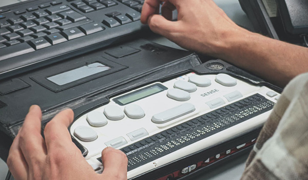
Don’t be afraid to use photography on your website! It can humanize the content you’re sharing, ensuring that patrons can see themselves at the library, and inspire your community to click, share and engage. When looking for photos to use on your website think about the overall sense you want to feel from your website. Are you looking for saturated images and colors, images that use a lot of natural light? Are you looking for images and interior shots that include people, or are you looking more for documentary styled images that imply movement and creativity?
Make sure you know the answers to those questions before you start looking for images.
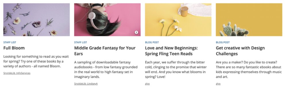
Why are we spending so much time talking about photography for your website? Well, aside from the statistics mentioned above, we know that visuals are a better way to bring people in. A common mistake on many library websites is to rely on the logos of the various online resources to supply visual appeal. We get it, librarians are busy, and it’s easy to just drop in a bunch of logos on the homepage to promote online resources. However, when libraries do this, they are building the brands of their vendors, and risk diluting the library’s brand. Your patrons shouldn’t care where your online content comes from, just that their beloved library provides so many amazing and fantastic resources to research, learn, inform, and entertain. Spend the time to look for a great royalty-free image that represents what you’re posting about, instead of simply posting the logo of the resource. Check out our article on creating customer-centered content for examples and how to feature your content, rather than content vendors.
A great place to find royalty-free images to use on your website is Unsplash. Unsplash features over 1 million high-resolution images, and they’re all free! Just don’t forget your proper image attribution when using these images.
When searching for images on Unsplash, or any other stock photo site, consider how you’re searching, not just what you’re searching for.


Editorial or playful ice cream cone, depending on your overall design.


Editoral ice cream cone.
You can search by the seasons and find lovely images for spring, summer, fall and winter. You can search by specific topics, depending on what you’re looking for.
Searches by location are similar in their outcome — locations like libraries, offices and studios, schools, or playgrounds can all offer an overarching context for your image searches.
Picking a photo background style can help you find a set of images with a similar style, like this collection of solid color background images, or these images that all feature textures. Building on that, you can also search for collections with a similar color palette such as yellow, green, or turquoise. Image collections based on emotions can also be an interesting way to frame your image searching, or you can always just search by aesthetic, such as minimalism or items held in hands.


Playful ice cream cones.
The images you choose on your library website are not just images, they are vital to communicating the library’s value, creating awareness of the library’s many services and resources, and reflective of the library’s overall brand. It’s important to translate the library’s brand into a visual concept, and to entice and engage with your patrons, especially those who are low-literacy. The imagery on your website adds additional visual cues to your content, and can act as a billboard for bringing more patrons to your programs, events, content, and branches. Of course, you want to encourage patrons to stop and browse a little longer on the library website, so consider the images you choose with all the same care you do with the titles on your shelves, and create a truly browseable and captivating site for your community.
Learn more:
-
Give credit where credit is due: Best practices for attributing images on your library’s website
-
Write for who ya got, not what ya got: Creating customer-centered content at the library
-
What is Content Marketing and Why Should Public Libraries Care?
-
The best things in life are free: Beautiful, free images to jazz up your library website
-
Decorative or Informative: Ensuring Images on your Library Website are Accessible