

.svg)


As people lean on the web for more of their daily lives, it has become critical for libraries to extend their strong in-person experiences to digital spaces. From the ability to browse a collection and borrow an item to connecting with the library and more, every part of the experience needs to carry over online. That's the anatomy we find in the best library websites.
Designing a modern and versatile library website is a must. To see how successful public library websites look, we’ve compiled a list of the best library websites today. We looked for public library websites that excelled in accessibility, aesthetic appeal, and functional ease of use.

7 Great Library Websites in 2023
1. Arapahoe Libraries
What We Love
Arapahoe Libraries uses its homepage to engage its online patrons right from the start of their journey. For example, the top of the homepage is dedicated to marketing the library’s upcoming events. Though online, the user feels as though they’re getting an inside look into what’s brewing at each physical location. The Arapahoe Libraries staff also did a great job at conveying the wide variety of programs they have in the works, thereby motivating everyone to visit their public library.
Why it Works
Arapahoe Libraries works to remove any obstacles between their user and the items, programs, and events of interest to them. Their main goal is to ensure that their online patrons can immediately access their public library’s resources and services as soon as they reach the website.
Things You Could Try
Use your website to connect your digital and physical experiences. Arapahoe Libraries, for example, gives its online users a look into what’s happening at each branch, thereby making them aware and motivated to visit. Your homepage becomes more than just a front to give one-way information, but a platform for people to find opportunities for social connection and personal growth.
2. Lawrence Public Library
What We Love
Lawrence Public Library dedicates the first row of its homepage to visually engaging its users. In fact, the Lawrence Public Library team uses the hero image to highlight major marketing promotions, campaigns, and other programs they’ve determined will deliver value to their patrons. Moreover, they use a strongly visible button to drive sign-ups for their call-to-action (CTA).
Next, the Lawrence Public Library homepage devotes a section to highlight its latest collections entries. One neat aspect of this section is that it lets users see newly available items across the library’s print, ebook, audiobook, and even entertainment catalogs (including video games!).
Why it Works
Lawrence Public Library uses its website (especially the homepage) to give its patrons tangible rewards each time they explore the library’s digital front. The hero image gives patrons a clear idea of what’s on offer from the library’s programming. Meanwhile, the carousels serve as a high-impact way to show the newest and most exciting items in the library’s collection.
This dual approach positions Lawrence Public Library to compete with other websites trying to capture the patron’s attention by engaging users on common areas of interest (e.g., social connection, media, entertainment, etc.).
Things You Could Try
Don’t restrict your library homepage into becoming a plain billboard of information, but rather, build it into an engaging experience. Think about the things your patrons are interested in, especially when they visit other websites, like ecommerce and social media. They want access to the latest media or to connect with other people. Tailor your homepage to show patrons that they can get those same tangible benefits from your public library.
3. Glenview Public Library
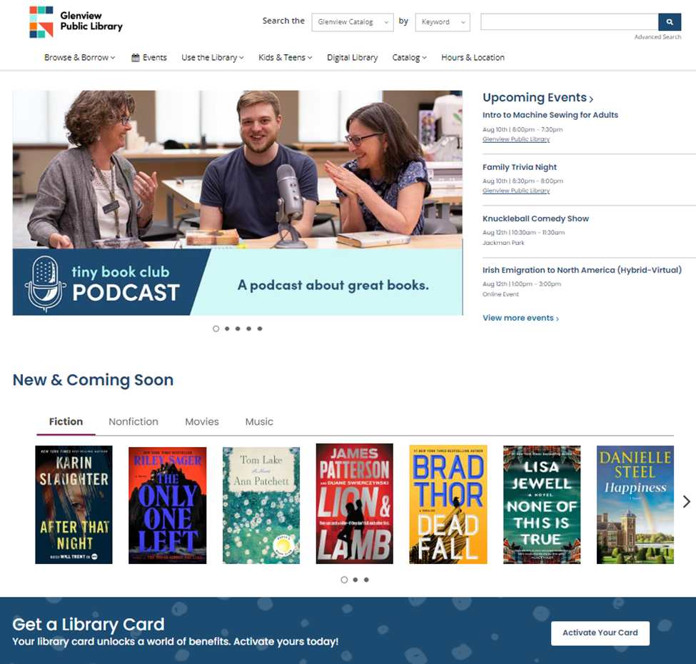
What We Love
Glenview Public Library’s homepage design dedicates lots of space to ‘conversing’ with the user. It isn’t just conveying static information (like branch hours), but rather, it’s directing patrons to different areas of the library, like its programs, events, collections, and resources. In a way, it feels as though the user is already at the library in person, and the staff are guiding them around to familiarize you with all that’s on offer. Blog posts, staff recommendations, and other staff-generated content play a key role in building the personal, ‘conversational’ approach.
Why it Works
When visiting online, Glenview Public Library’s patrons get a complete sense of what’s available and, more importantly, reasons to explore further and return later. This approach helps propel the public library to the top of the user’s mind and, in turn, merits more of their attention.
Things You Could Try
The ‘conversational’ approach helps your public library connect with your online patrons at a deeper level. The key to achieving that is to start putting your staff at the forefront of your website, just as they work at the forefront of your physical locations. Empower their voices by providing them with the tools to write blog posts and recommended reading lists so that users feel that someone’s helping them. This brings some human interaction into the mix, making the website experience welcoming and personal – not cold or mechanical.
4. Stark Library
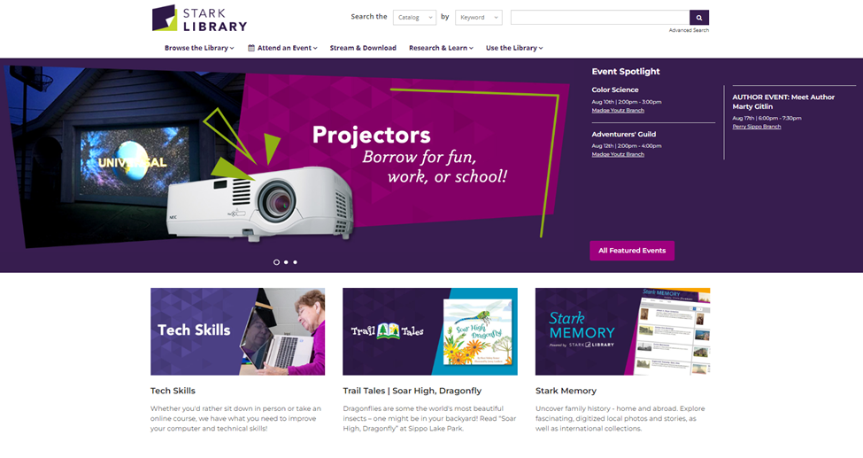
What We Love
One of the first things we noticed about Stark Library’s homepage is that it promotes ‘clusters’ centered on patron interests and needs. For example, the “Tech Skills” link leads users to a comprehensive page on how to build digital literacy, upcoming events, access to key resources (e.g., courses and platforms like LinkedIn Learning) and more. In other words, Stark Library mobilizes all of its resources in each ‘cluster’ in response to the real-life needs of its patrons.
Why it Works
Stark Library heavily invests in helping its patrons with their day-to-day lives, from upskilling to legal services to finding ways to save money. It’s no surprise then that Stark Library’s website places these services at the center of its online experience, thus ensuring that people connect with valuable resources.
Things You Could Try
Don’t shy away from showing how much your library is evolving. Like many public libraries, you’re likely past the point of solely providing books and, instead, are a dynamic hub that delivers services and brings people together. Let those changes shine through on your website by creating pages that explain each of your services and, more importantly, how people can access them.
5. Kitsap Regional Library
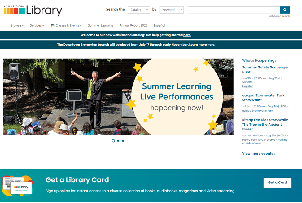
What We Love
Kitsap Regional Library’s homepage is an excellent example of “less is more.” They’re not doing anything fancy; instead, the team just focused on connecting the user to the resources and items they want with as little friction (i.e., distractions or user experience barriers like forms or sign-ups) as possible.
Why it Works
The library put their online patron’s needs at the center of the website experience. The team at Kitsap Regional Library looked for what their patrons would want when visiting the website and, in turn, placed those resources on the homepage. Not only that, but the homepage design is clean and uncluttered; in a way, the library gives the user space to explore at their own pace without pressure or distractions.
Things You Could Try
Consider trimming your homepage down to the information, resources, and items of interest to your online patrons. Leverage simplicity as a way to build an intuitive and easy-to-navigate experience; it’ll help your patrons get to the things they want.
6. Halifax Public Libraries
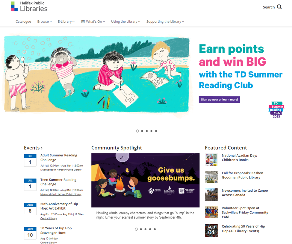
What We Love
Halifax Public Libraries uses a sliding hero carousel to market its multiple programs, events, and campaigns to its online patrons. Each hero image follows a common design language: First, each background image is visually expressive and engaging. Second, there’s a minimal use of words; the library wants to “show” more than “tell.” Third, the CTAs for driving sign-ups and engagement are buttons that are easy to pick out and click. However, the entire image is clickable, which is an effective way of making it accessible to more users.
Why it Works
The sliding carousel is a high-impact way of driving attention to your programs, events, resources, facilities, and other points of interest. It’s not only visually appealing, but it’s also dynamic, which generates multiple opportunities to engage the user by presenting them with different options.
Things You Could Try
Consider using expressive imagery to communicate. It’s an effective way to draw the user’s interest towards the programs and campaigns you’re marketing.
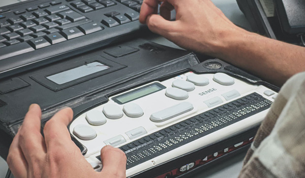
However, to ensure your visual assets are accessible to non-sighted patrons, you should also explain what the image is about in the alternative text (alt-text). Doing so tells the user (via audio) what the image is about, thus empowering all your online patrons to understand what you have on offer.
7. Saint Paul Public Library
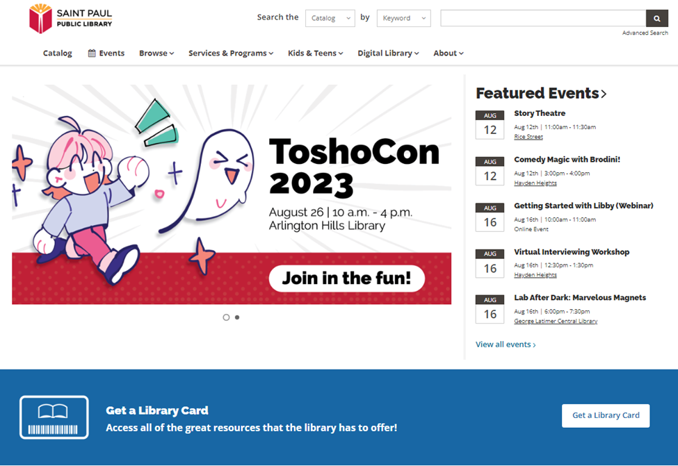
What We Love
Like our earlier examples, Saint Paul Public Library curates its homepage to deliver the items, programs, and resources of interest to its patrons. Thus, when people visit the library website, they both get a feel of what’s happening at the physical location and immediate access to the things they want to check out.
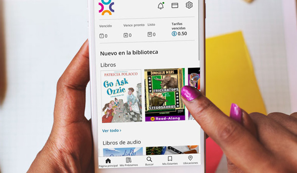
Moreover, leaning on the digital native nature of its online patrons, Saint Paul Public Library also built a specific section on the homepage to showcase its digital library. This gives online patrons the ability to leverage their public library’s resources from the comfort of their homes or wherever they are without the need to come into the physical location.
Why it Works
Providing a digital native experience is an effective way of building and retaining patron interest in their public library. It’s seamless, convenient, and accessible. Moreover, it positions the public library to offer support and services to more community members, especially those who prefer engaging online. It also positions the public library as an alternative to other sources of media, courses, and resources.
Things You Could Try
Try incorporating both a self-contained digital experience and an incentive to jump from digital to the physical location(s) where appropriate. Either way, the key is to show your online patron that they’ll get delightful and rewarding experiences across both mediums. For example, in addition to creating an easy pathway to your digital library, you can promote closely relevant in-person events at your branches that may offer unique benefits, like social events, mentorship, and peer connectivity.
|
|
Webinar - Not Everything Can Go on the Homepage Hear from three individuals who helped design a new homepage and simultaneously developed a new marketing strategy.
|
.png?width=303&height=179&name=BC%20Blog%20Heroes%20(1).png)

Next Steps: Making Your Library Website an Inspirational Example
In our list of the best library websites, we identified several common design elements:
First, it’s critical to engage your online patrons as early as possible. Don’t settle for a passive experience where people will only read what you have to say; rather, create pathways for patrons to find something in your digital and physical collections, access services, and discover through exploration.
Second, think about delivering value to all website visitors. You can do this by clearly spotlighting how you can help your patrons with their daily lives (e.g., Stark Library) and by building an intuitive, clutter-free user experience so that people get to what they want quicker.
Third, be visual and focus more on “showing” than on “telling.” Yes, images won’t work for everyone, but even when you write alt-texts for accessibility, you can use active and descriptive words to give listeners a precise and vivid understanding of what you’re showing.
For a deeper dive on how to achieve these goals, check out our guide on the best practices for designing a library website.
Sign up to receive the latest in public library topics delivered straight to your inbox!